Example Analysis
example_analysis.RmdThis script demonstrates how to use the susR package to retrieve data on population size and mean age in Slovak districts from the Slovak Statistical Office API, specifically from tables om7011rr and om7005rr.
It includes: 1) Retrieving list of district codes. 2) Preparing parameters for API call. 3) Retrieving the data with get_susr_data(). 4) Merging data. 5) Performing a basic analysis. 6) Plotting the results.
Construct parameters for get_susr_data
The table_codes are “om7013rr” and “om7005rr”.
The dimension parameters must be supplied in the same order as they appear in the example href for this table.
For om7013rr we have 3 dimension parameters in this order:
- om7013rr_vuc: regional codes, we will supply a vector
- om7013rr_obd: “all” years
- om7013rr_ukaz: “IN010052” for permanently living mid-year population
- om7013rr_poh: c(“1”, “2”) for sex
For om7005rr we have 4 dimension parameters in this order:
- om7005rr_vuc: regional codes, we will supply a vector
- om7005rr_obd: “all” years
- om7005rr_ukaz: “IN010089” for the mean age
- om7005rr_poh: c(“1”, “2”) for sex
Since we are interested in 79 districts, we firstly retrieve the
dimension values and use the vector of values to feed
fetch_susr_data() function. The codes are the same for both
tables, so we will do it only once.
districts <- susr_dimension_values("om7013rr",
                                   "om7013rr_vuc") |>
  filter(str_detect(element_label, "District of"))


params <- list(
  "om7013rr", # 1st table
  list( # list of params for 1st table
    districts$element_value, # vector of district codes
    "all",                   # all years
    "IN010052",               # population
    c("1", "2")              # sex: 1 = M, 2 = F

    ),
  "om7005rr", # 2nd table
  list( # list of params for 2nd table
    districts$element_value, # vector of district codes
    "all",                   # all years
    "IN010089",              # mean age
    c("1", "2")              # sex: 1 = M, 2 = F
    )
)
Fetch data
res <- fetch_susr_data(params)

# res is a named list with two entries
pop_df <- res[["om7013rr"]]
age_df <- res[["om7005rr"]]
Let’s inspect the data:
summary(pop_df)
#>  om7013rr_vuc       om7013rr_obd       om7013rr_ukaz      om7013rr_poh
#>  Length:4424        Length:4424        Length:4424        Length:4424
#>  Class :character   Class :character   Class :character   Class :character
#>  Mode  :character   Mode  :character   Mode  :character   Mode  :character
#>
#>
#>
#>  om7013rr_data          value
#>  Length:4424        Min.   : 5338
#>  Class :character   1st Qu.:19797
#>  Mode  :character   Median :30844
#>                     Mean   :34242
#>                     3rd Qu.:47132
#>                     Max.   :90029
summary(age_df)
#>  om7005rr_vuc       om7005rr_obd       om7005rr_ukaz      om7005rr_poh
#>  Length:4424        Length:4424        Length:4424        Length:4424
#>  Class :character   Class :character   Class :character   Class :character
#>  Mode  :character   Mode  :character   Mode  :character   Mode  :character
#>
#>
#>
#>  om7005rr_data          value
#>  Length:4424        Min.   :28.19
#>  Class :character   1st Qu.:36.09
#>  Mode  :character   Median :38.58
#>                     Mean   :38.52
#>                     3rd Qu.:40.95
#>                     Max.   :46.84
We already see, that there are quite some differences in regions both in population and in mean age.
Basic data wrangling
We will adjust the raw data to be more user-friendly and follow more common conventions. Afterwards we will merge both tables into one.
cleaned_pop_df <- pop_df |>
  rename( # renaming to more user-friendly names
    district = om7013rr_vuc,
    year  = om7013rr_obd,
    population  = value,
    sex = om7013rr_poh
  ) |>
  mutate(sex = ifelse(sex == "Men", 0, 1)) |> # refactoring sex
  select(district, year, sex, population)


cleaned_age_df <- age_df |>
  rename( # renaming to more user-friendly names
    district = om7005rr_vuc,
    year  = om7005rr_obd,
    mean_age  = value,
    sex = om7005rr_poh
  ) |>
  mutate(sex = ifelse(sex == "Men", 0, 1)) |> # refactoring sex
  select(district, year, sex, mean_age)

merged_df <- cleaned_pop_df |>
  left_join(cleaned_age_df, by = join_by(district, year, sex), keep = FALSE)
Analysis
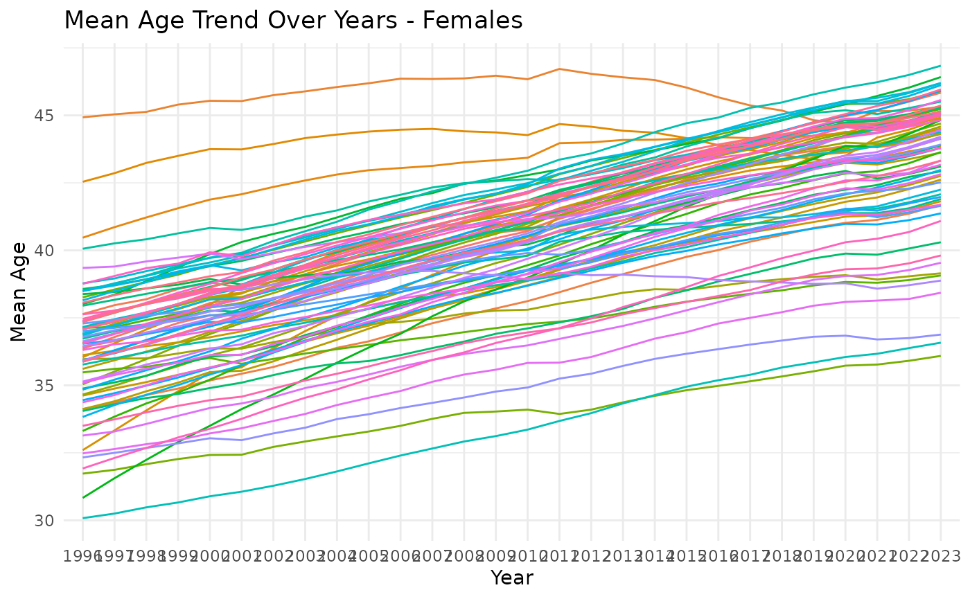
ggplot(merged_df |> filter(sex == 1), aes(x = year, y = mean_age, group = district, color = district)) +
  geom_line() +
  labs(title = "Mean Age Trend Over Years - Females", x = "Year", y = "Mean Age") +
  theme_minimal() +
  guides(color = "none")
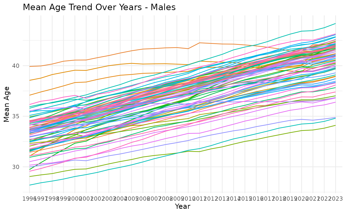
ggplot(merged_df |> filter(sex == 0), aes(x = year, y = mean_age, group = district, color = district)) +
  geom_line() +
  labs(title = "Mean Age Trend Over Years - Males", x = "Year", y = "Mean Age") +
  theme_minimal() +
  guides(color = "none")
As we can see, most of district age getting older. However there are
couple of flat-ish ones disrupting this pattern.
# Calculate population per district per year
data_bubble <- merged_df |>
  reframe(
    .by = c(district, year),
    tot_population = sum(population),
    mean_age = round(sum(mean_age * population) / tot_population, 1)
  ) |>
  group_by(year) |>
  mutate(
    age_decile = ntile(mean_age, 10)  # Divide districts into deciles by mean age
  ) |>
  ungroup()


# Animated interactive bubble chart
bubble_chart <- plot_ly(
  data_bubble,
  x = ~tot_population,
  y = ~mean_age,
  size = ~tot_population,
  sizes = c(10, 250),
  color = ~age_decile,
  frame = ~year,
  text = ~district,
  type = 'scatter',
  mode = 'markers'
) %>%
  layout(
    title = "Change over Time",
    xaxis = list(title = "Total Population"),
    yaxis = list(title = "Mean Age"),
    showlegend = FALSE
  ) |>
  colorbar(title = "Age decile")

bubble_chart
From the animated chart we can see that some of the districts have very different “movement” in time. Especially district Senec moves to lower deciles of mean age - meaning that it is ageing slower than other districts. In fact it seems like the mean age is stable in last 20 years.